Ten Words

  • average
  • clumsy
  • strange
  • confident
  • cool
  • friendly
  • smart
  • clever
  • young
  • funny

Friday, August 24, 2018

Self portrait vid


         We had a project to where we had to make a one shot video without editing. I had my friend film me making chili because I was already going to make chili that day. I didn't make this video for a purpose I just needed to film something that I did and this was the most interesting thing I did that weekend.
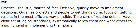
          I did nothing with the camera that was special. There was no reason to do anything special with the camera since it was not to be a good film of any sort. I just had my friend record me with my phone and he was just focusing on what I was doing. 


                All I was showing in my self portrait was what I did during the weekend. Nothing was much of an effort to make this video great or stand out. It was not a difficult thing to do and I met almost all of the project guidelines.
             My process to make this video was asking my friend if he could come over ad film me making chili and I only used a small amount of what he filmed because the rest was very long. I think my video was successful because it explained what I was doing and showed it.
             I didn't really learn anything new because we weren't tasked with anything out of the ordinary so I didn't go above and beyond. The only challenge I faced was that the original video was to long.

Tuesday, May 22, 2018

E9 Final Exam


This quarter we had a project. We were tasked with making a product and building a campaign around the product. This took close to the whole quarter. I feel like we did not have enough time to finish things and the order of the rotations was a challenge. I did not take anything away from this project but I did have to use time management. I thought I worked well in 4th quarter.

   We completed all of our tasks in class.we used our time to finish what we needed to do and we had no complications. I did nothing outside of class to improve because I felt I did not need to improve.

    I used my time and I figured out how to do more stuff in the adobe programs. I did not work to improve but to maintain in the adobe programs.

 I liked being able out hang out with my friends more this quarter. I would have made the final the presentation and not a blog. I took nothing away from this quarter. I would like to be able to do more video next year. Overall the blogs were the only thing that made me not want to work but I found everything else that we did fine.

Thursday, March 8, 2018

CSS and CARP Design

      The project that I did is a adobe dreamweaver project. I used html files and css files. I fixed most of the things on the page that were lacking carp. Carp is Contrast. Alignment, Repetition. and proximity

       There are differences about starting and finishing htmls. Before an html is changed it have blank everything. It is black font, white background, and possibly pictures. Once an html is changed you select margins, fonts, colors, ect. 
        
      I used carp a lot in this project to fix and make the poem better. one of the four is contrast which makes the colors look better and makes it so hey look good. alignment is important because it makes everything look together.
     
      Repetition makes sure there isn't a lot of one thing. proximity makes sure everything is in equal distance of each other. In CSS i learned how to change html without knowing how to code in html format.

Friday, March 2, 2018

LOBG Personality

This test did better and described me more than the briggs test. I like to lead and I am very argumentative and very direct. I got a Lion for my end result. And I do not express my emotions very much.

personality test

My personality type is ESTJ. It stands for Extraverted, Sensing, Thinking, And Judging. ESTJ’s want to take charge and are orderly and they like to get things done. Sam Walton (the founder of Walmart) and George Bush are both ESTJ’s.
The ESTJ personality type is not 100% accurate for me. I am realistic and practical. I do not like to organize projects though. So not everything about this personality type is true. My personality type describes some stuff about me. I bet that all the other personality type describe at least some stuff about me.

I did not learn much from this assignment except that tests that require extensive work get more stuff on the spot.

Thursday, March 1, 2018

My Logos


These are the logos i have been working on in class for awhile, there are also mock ups for our logos that we used to see how our logos would look like on real life products. I started by brainstorming and drawing what I wanted my logo to look like then I copied them in Illustrator and decided which one I liked best. I then fixed all the small impurities. The color was the hardest part to figure out what I wanted in my opinion. There were gradients you could use and a lot of different colors. I settles on a gold circle and an orange gradient for the logo.


Friday, January 26, 2018

This is my typography projects. In this project i pointed out some of the the parts of typography in my own name. I learned some things about typography like the types. I did not know most of the parts of typography. I know also know how to use adobe illustrator more fluidly.

Thursday, January 18, 2018

Color Wheel

This project was our first project in adobe illustrator. We were tasked with making a color wheel with primary, secondary, and primary and secondary mixed colors. It consists of 12 colors that are all from the 3 primary colors. yellow, red, and blue makes the rest of the colors on the color wheel.
         in illustrator I did not learn that much. Most stuff is the same as photoshop. I did learn how to make the background transparent and how to make a dashed line.
      I did everything as well as I could. I do not think I would do anything different if I were to do this project again.


Monday, January 8, 2018

Logo Color Schemes

Analogous 


This logo uses the analogous colors of red, purple and yellow . I think the company probably chose these color because they go together.


This logo uses the analogous colors of red, yellow and orange. I think the company probably chose these color because they go well together.


Complimentary


This logo uses the complimentary colors of red and blue. I think the company probably chose these color because they compliment each other.


This logo uses the complimentary colors of red and blue. I think the company probably chose these color because it is friendly looking.


Warm


This logo uses the warm colors of red and yellow. I think the company probably chose these color because its basic and will attract attention.


This logo uses the warm colors of red and white. I think the company probably chose these color because it looks good.


Cool


This logo uses the cool colors of green, yellow and white. I think the company probably chose these color because its simple.


This logo uses the cool colors of blue and light blue. I think the company probably chose these color because its simple.


Monochromatic


This logo uses the monochromatic colors of blue and white. I think the company probably chose these color because its simple.


This logo uses the monochromatic colors of blue and white. I think the company probably chose these color because its simple.


Triad Color


This logo uses the triad colors of blue and yellow. I think the company probably chose these color because it attracts attention.


This logo uses the triad  colors of yellow ,red and blue. I think the company probably chose these color because it will attract attention.