Ten Words

  • average
  • clumsy
  • strange
  • confident
  • cool
  • friendly
  • smart
  • clever
  • young
  • funny

Friday, March 2, 2018

personality test

My personality type is ESTJ. It stands for Extraverted, Sensing, Thinking, And Judging. ESTJ’s want to take charge and are orderly and they like to get things done. Sam Walton (the founder of Walmart) and George Bush are both ESTJ’s.
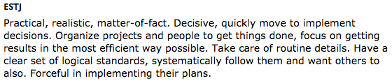
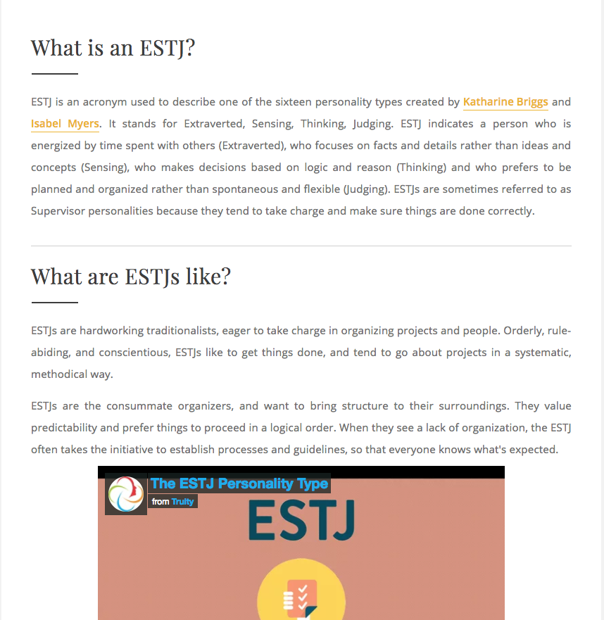
The ESTJ personality type is not 100% accurate for me. I am realistic and practical. I do not like to organize projects though. So not everything about this personality type is true. My personality type describes some stuff about me. I bet that all the other personality type describe at least some stuff about me.

I did not learn much from this assignment except that tests that require extensive work get more stuff on the spot.

Thursday, March 1, 2018

My Logos


These are the logos i have been working on in class for awhile, there are also mock ups for our logos that we used to see how our logos would look like on real life products. I started by brainstorming and drawing what I wanted my logo to look like then I copied them in Illustrator and decided which one I liked best. I then fixed all the small impurities. The color was the hardest part to figure out what I wanted in my opinion. There were gradients you could use and a lot of different colors. I settles on a gold circle and an orange gradient for the logo.


Friday, January 26, 2018

This is my typography projects. In this project i pointed out some of the the parts of typography in my own name. I learned some things about typography like the types. I did not know most of the parts of typography. I know also know how to use adobe illustrator more fluidly.

Thursday, January 18, 2018

Color Wheel

This project was our first project in adobe illustrator. We were tasked with making a color wheel with primary, secondary, and primary and secondary mixed colors. It consists of 12 colors that are all from the 3 primary colors. yellow, red, and blue makes the rest of the colors on the color wheel.
         in illustrator I did not learn that much. Most stuff is the same as photoshop. I did learn how to make the background transparent and how to make a dashed line.
      I did everything as well as I could. I do not think I would do anything different if I were to do this project again.


Monday, January 8, 2018

Logo Color Schemes

Analogous 


This logo uses the analogous colors of red, purple and yellow . I think the company probably chose these color because they go together.


This logo uses the analogous colors of red, yellow and orange. I think the company probably chose these color because they go well together.


Complimentary


This logo uses the complimentary colors of red and blue. I think the company probably chose these color because they compliment each other.


This logo uses the complimentary colors of red and blue. I think the company probably chose these color because it is friendly looking.


Warm


This logo uses the warm colors of red and yellow. I think the company probably chose these color because its basic and will attract attention.


This logo uses the warm colors of red and white. I think the company probably chose these color because it looks good.


Cool


This logo uses the cool colors of green, yellow and white. I think the company probably chose these color because its simple.


This logo uses the cool colors of blue and light blue. I think the company probably chose these color because its simple.


Monochromatic


This logo uses the monochromatic colors of blue and white. I think the company probably chose these color because its simple.


This logo uses the monochromatic colors of blue and white. I think the company probably chose these color because its simple.


Triad Color


This logo uses the triad colors of blue and yellow. I think the company probably chose these color because it attracts attention.


This logo uses the triad  colors of yellow ,red and blue. I think the company probably chose these color because it will attract attention.


Monday, August 28, 2017

Chalking about us


Cool chalk drawings!

A while ago in e-Comm we made chalk drawings symbolizing us and I got some good pictures of my Groups chalk drawing!